Quick Send Communication
A new experience for operators to send emails easily

Company
Launchpad
Timeline
Q2 to Q3 2023
Team
CEO
1 Designer
1 Engineer
Role
I led the end-to-end design
strategy, design and
execution, from ideation to
usability testing.
Heading
To tackle this problem, I conducted a design audit of the current tool and in-depth user interview to identify security and usability concerns. Through my research, I strive to improve the following areas:
Memorability Concerns --> Improve Efficiency
User Confusion --> Enhance Usability
Security Issues --> Establish Trust
Improving the usability and trust of the tool was crucial for user adoption and long-term success for the business
Company
Launchpad
Timeline
Q2 to Q3 2023
Team
CEO
1 Designer
1 Engineer
Role
I led the end-to-end design
strategy, design and
execution, from ideation to
usability testing.
Overview
Security and customer service painpoints
Launchpad is committed to delivering a product that emphasizes both security and usability. With that said, there are two areas of concerns that needed to be addressed:
❌ Security Concerns
Studio operators had concerns about the security of their customers' emails, fearing potential leaks during mass communications.
→
✅ Establish Trust
Communicate data privacy and information sharing protocols with tool tips

❌ Too Many Customer Service Calls
The quick send tool was confusing to operators. They constantly call in to ask how to use the email tool.
→
✅ Create familiar UI with guided discovery
Using common design patterns and industry standards instead of reinventing the wheel
Using context based onboarding to educate operators
100%
Positive user feedback on trust + security
50%
Reduced customer service requests
40%
Reduced time for operators to send an email
How might we reduce the complexity of sending mass emails while prioritizing operators' privacy and trust?

"Our users think that the current tool will leak all customer emails because it looks too similar to our personal Gmail tool”
-CEO on customer voice
Implement nudges at critical points in the email creation process, while providing just-in-time guidance and tutorials
Through multiple rounds of ideation with my CEO, I rapidly prototyped low-fidelity models, quickly testing core features and incorporating early user feedback from one of our user users.

Key Features
Step 1: Establish trust
Communicate data privacy and information sharing protocols with tool tips
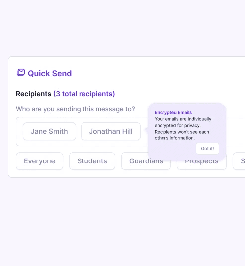
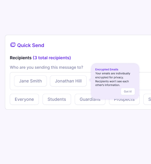
Just-in-time tooltips for decision making
Tooltips/nudges during the time an operator makes a decision can help alleviate their security concerns and reassured them that their data won’t be leaked
Step 2: Create Familiar UI with Guided Discovery
Using common design patterns and industry standards instead of reinventing the wheel
Educating operators to improve feature adoption
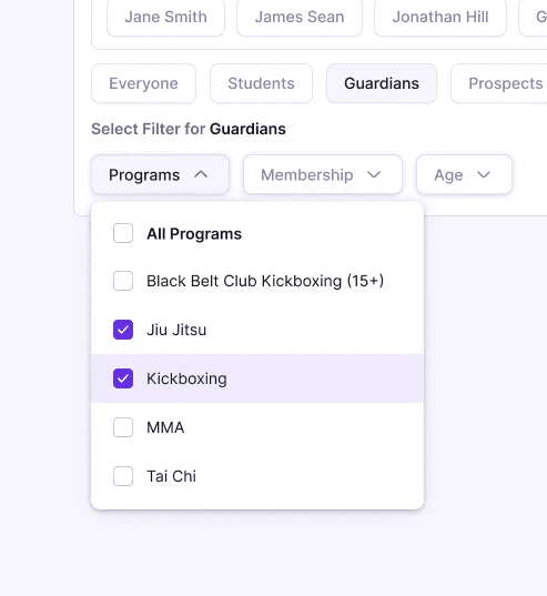
Make it intuitive for operators to filter contacts
Using industry standard filter buttons removed complexity from before, making it familiar and intuitive for operators to use.

Provide nudges to guide operators through each step
Operators forget how to use the specifics of the tool often. Onboarding nudges provide step by step walkthroughs

Make it easy for operators to complete tasks
The two different UI for individuals and group recipients in the current tool is confusing for operators to use and find. Combining the two UI with an autofill functionally simplified the feature and reduced clicks
Rapid Prototyping with Product + Eng
We had a lean team of 3 (CEO, engineer, me) and rapidly iterated on the tool so we could get it in front of the user quickly
CEO collab
Eng collab
Kickoff Meeting revealed usability and security concerns
Voice of customer reveal communication tool’s usability and security concerns
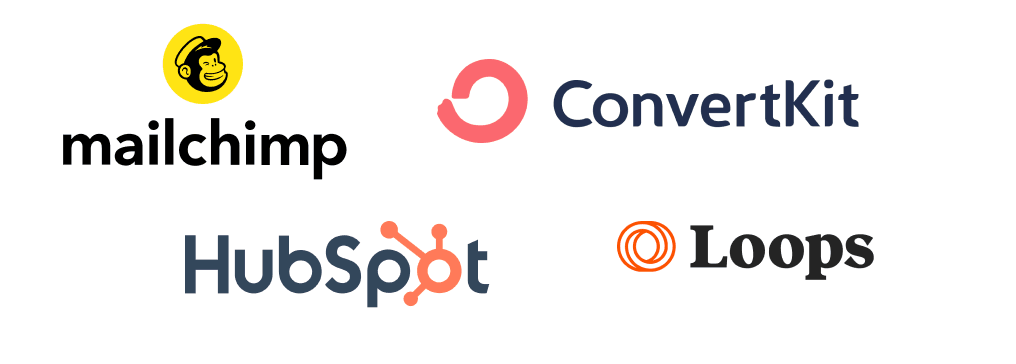
Drew inspiration from Mailchimp and ADPList
Top email campaign tools trend towards step-by-step guidance. I also took inspiration from ADPlist and Google Flights for simplified filters.
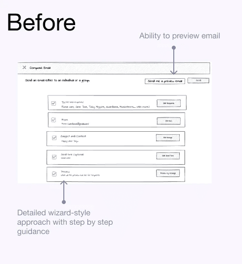
Phase 1: Wizard Mode
Using inspiration from my competitor, I took a first pass of creating a wizard-like interface with simplified filters
Users asked for additional filter labels
I tested the MVP with one of our super users, and received positive results for the filter’s ease of use.
Audit showed current filter is not MECE
Filter is not “MECE” and does not cover full search criteria. Additionally, UI between individuals + group recipients differ drastically
Logic flow revealed timeline constraints
I provided a preview of the new design and logic flow decision points, and discussed constraints and timelines with engineers
Phase 2: Pivot to MVP
A full wizard would take too long to develop, and user testing is key, so I pivoted to just the recipient section for a more timely delivery
Planning our Rollout
With the largely positive reaction, initial MVP rollout planning to be released
Fine-tuning the 'recipient section' rather than reaching feature parity
My goal was providing users with a focused and refined experience, minimizing complexity, and ensuring the product excelled in usability and performance. By focusing on depth over breadth, I prioritized the experience of the recipient feature in the final product which had the highest return on customer impact.
Due to NDA reasons, please reach out for full case study available in portfolio presentation

Wizard style takes too long for developers
I initially planned a detailed wizard-style process for the Quick Send Email Tool but realized it would delay development and conflict with its 'quick sending' concept. So, I pivoted to an MVP approach, streamlining to just the recipient section in the original design to ensure a more timely delivery


"The new design is much more user friendly. I would rate it 10/10 for it's ease of use"
Studio Operator Customer ( super user)
Founder, Martial Arts Studio
Results
Additional user testing confirmed the success of my streamlined MVP approach, with positive feedback on usability. The improved tool:
Eased concerns around trust for studio operators.
Provided just enough guidance without overwhelming users.
Enabled us to focus on strategic work instead of customer service calls.
In the next phase, I'll explore adding nice-to-have features like a preview mode and communication templates.
Quick Send Communication Tool
A quick send communication tool for operators to send emails more easily.

Overview
Security and customer service concerns
Launchpad is committed to delivering a product that emphasizes both security and usability. With that said, there are two areas of concerns that needed to be addressed:
❌ Security Concerns
Studio operators had concerns about the security of their customers' emails, fearing potential leaks during mass communications.
→
✅ Establish Trust
Increase operator’s trust around Launchpad’s usage of information sharing and data privacy
❌ Too Many Customer Service Calls
The quick send tool was confusing to operators. They constantly call in to ask how to use the email tool.
→
✅ Create familiar UI with guided discovery
Familiar UI : Create UI inspired from other tools that operators use on a daily bases to improve adoption rate
Guided discovery: Improve in-app guidance for users to use the tool by themselves without help
Company
Launchpad
Timeline
Q2 to Q3 2023
Team
CEO
1 Designer
1 Engineer
Role
I led the end-to-end design
strategy, design and
execution, from ideation to
usability testing.
How might we reduce the complexity of sending mass emails all while prioritizing operators' privacy and trust?
"Our users think that the current tool will leak all customer emails because it looks too similar to our personal gmail tool”
-CEO on customer voice
100%
Positive user feedback on trust + security
40%
Reduced customer service requests
50%
Reduced time for operators to use email tool
Implement nudges at critical points in the email creation process, while providing just-in-time guidance and tutorials
I rapidly prototyped through low-fidelity models, quickly testing core features and incorporating early user feedback to streamline the design process.
Solution
Security concerns
Establish trust: Increase operator’s trust around Launchpad’s usage of information sharing and data privacy
Too much handholding
Create familiar UI : Create familiar UI inspired from other tools that operators use on a daily bases to improve adoption rate
Guided discovery: Improve in-app guidance for users to use the tool by themselves without help
Key Features
Step 1: Create Familiar UI
Filter Buttons
The simplified filter buttons removed complexity from before, making it familiar and intuitive for operators to use.

Step 2: Guided Discovery
Nudges for self service
Operators forget how to use the specifics of the tool often. Nudges provide feature walkthroughs and reassured operators about data security.
Autofill for individuals and groups
The two different UI for individuals and group recipients in the current tool is confusing for operators to use and find. Combining the two UI with an autofill functionally simplified the feature and reduced clicks
Step 3: Establish Trust
Just-In-Time Tool Tips
Tooltips/nudges during the time an operator makes can help alleviate their security concerns and reassured them that their data won’t be leaked
Focusing on select quality features rather than aim for feature parity for a refined experience
This choice was driven by the goal of providing users with a focused and refined experience, minimizing complexity, and ensuring that every feature excelled in usability and performance. By prioritizing depth over breadth, I aimed to deliver a more satisfying and user-centric product.
Due to NDA reasons, please reach out for full case study available in portfolio presentation


"The new design is much more user friendly. I would rate it 10/10 for it's ease of use"
Studio Operator Customer ( super user)
Founder, Martial Arts Studio
Results
User testing confirmed the success of the streamlined MVP approach, receiving positive feedback on the tool's usability, ready to be shipped. In the next phase, I plan to explore adding in the nice to have features such as preview mode, and communication templates.