Quick Send Communication Tool
Overview
In response to the usability needs of studio operators, I led the redesign of the Quick Send Email Tool. The primary challenge of the current tool was two-fold: studio operators had concerns about the security of their customers' emails, fearing potential leaks during mass communications. Moreover, the current email tool was confusing preventing operators' ability to efficiently oversee their communications.

Company
Launchpad
Timeline
Q2 to Q3 2023
Role
I was the sole designer that led the end-to-end design strategy and design and execution, from ideation to usability testing.
Strategy
To tackle this problem, I conducted a design audit of the current tool and in-depth user interview to identify security and usability concerns. Through my research, I strive to improve the following areas:
Memorability concerns —> Improve efficiency
User confusion —> Enhance usability
Security issues —> Establish trust
Improving the usability and trust of the tool was crucial for user adoption and long-term success for the business
Results
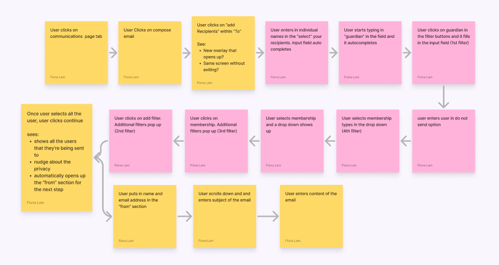
Through iterating with my studio operators aka "super users," the new tool design successfully addressed the specific security and usability challenges faced by studio operators. By focusing on user guidance, simplification of features, and building trust through clear communication, the tool not only alleviated concerns but also significantly improved efficiency and productivity for studio operators in their daily email management tasks.

Usability based on customer feedback
Reduced Time to Send Emails
Reduced email-related admin tasks

Improved Efficiency
Studio operators reported a 40% reduction in the time spent on email management tasks due to the intuitive design, guided user experience with autofill, and reduced onboarding learning curve.
Established Trust
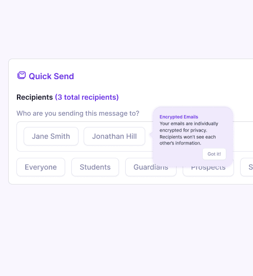
The new design gained the trust of studio operators by addressing security concerns with the new tool tips that provided user guidance and reassured operators about data security.
Enhanced Usability
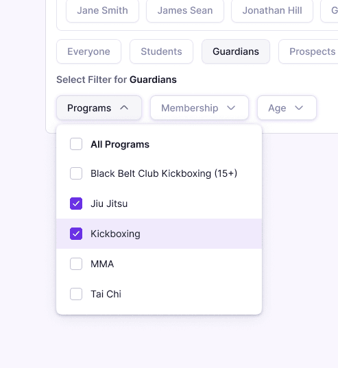
The tool addressed usability confusion by simplifying filter usage, streamlining group email sending interfaces, and providing onboarding tutorials and tooltips.


Process
I initiated the process by conducting a comprehensive usability audit of the existing tool. This audit allowed me to pinpoint specific usability concerns in the current tool including:
Redundancies in clicking the same CTA: 11 clicks before composing email
Long list to select from programs and memberships
Group messages and individual messages have vastly different interfaces
Confusion around sending out from personal versus business emails


Not M.E.C.E
While examining the information hierarchy during my usability audit, I identified a specific area where it's not MECE (Mutually Exclusive, Collectively Exhaustive) —namely, in the email recipient filters.
Not Collectively Exhaustive: The filters does not cover all possible criteria or categories that operators might need.
Confusing Filtering Options: If the filters are not well-organized and categorized, users may struggle to understand how to filter emails according to their preferences. Ambiguity or lack of clarity in the filtering options can lead to user frustration.

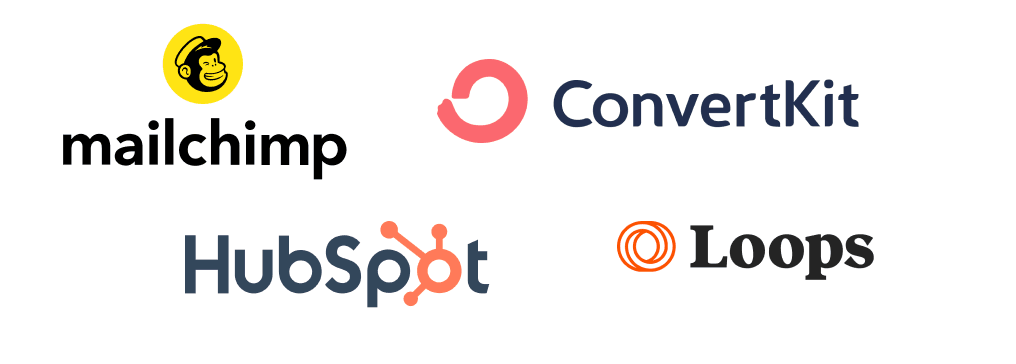
Inspiration from Email Campaign Tools
With these concerns in mind, I analyzed similar email campaign tools to understand how they tackled design challenges similar to mine, and prioritized those that aligned with my usability and security concerns:
Nudges for Usability and Security, such as tooltips and in-app guidance, were prioritized for addressing user confusion and security concerns.
Easy Filter Buttons simplified the filtering process, enhancing user efficiency.
Nice-to-Have features like preview emails and a wizard modal were lower priority, as they didn't directly address primary usability and security concerns.

Rapid Iterations: Tradeoff #1
Development Time vs. User Experience: I initially planned a detailed wizard-style process for the Quick Send Email Tool but realized it would delay development and conflict with its 'quick sending' concept. So, I pivoted to an MVP approach, streamlining to just the recipient section in the original design to ensure a more timely delivery

Rapid Iterations: Tradeoff #2
Feature Parity vs. Streamlined Experience: At first, I aimed for feature parity similar to Mail Chimp, but opted to prioritize a streamlined experience to gather user feedback. For example, I opted to remove the 'preview email' button to simplify the tool.


Rethinking the Filter Component
I pieced together the filter component using atomic design. Starting with core elements, I structured them hierarchically to accommodate four levels of filtering. Variants were explored for adaptability and usability.

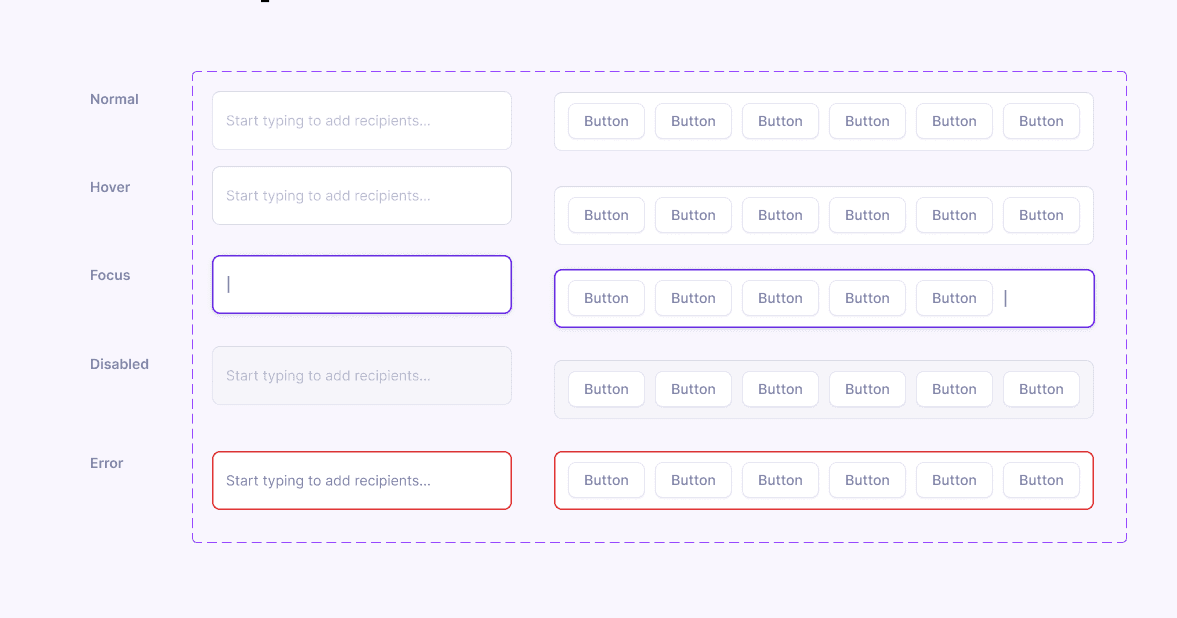

Putting it All Together
I expanded our design system by crafting filter components that offered a solution to the typical Boolean "and" and "or" complexity that common email tools have. These filter buttons were designed to accommodate four levels of filtering, allowing users to progressively refine recipient groups with precision and ease, enhancing the tool's usability and flexibility.
